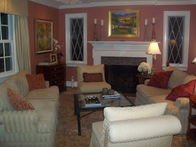
Helped a client with her living room.
She wasn't crazy about her room set up
and asked for my suggestions.
Take a look...
THE BEFORE:
 (Sorry about the fuzzy photos...
I blame operator error)

As you can see, furniture pieces were squared off
and pushed up against surrounding walls.


Now take a look at
THE AFTER:


Furniture was pulled off walls, space was opened up
and accessories were streamlined.


We used only items that were already in the house.
Let me know your thoughts.
As always, thanks for visiting.


Wow! So much better. It is always scary to pull furniture off the walls, but it almost always looks better.
ReplyDeleteGreat work!
Love from,
Greta
G,
ReplyDeleteThanks for the kind words, again. My goal is to have no sofa up against any wall. So far so good.
Would love to see pics of your fantastic mid century style.